Some general comments on visualization
Introduction
R’s basic graphic capabilities can be effective for communicating basic features of data and statistical models. In the domain of genome science, many specialized visualizations have been developed, and a number of Bioconductor packages simplify the production of important classes of visual representations of genomic elements and assay readouts.
In this brief overview we examine a few very basic concepts of genomic visualization, and then sketch two approaches to interactive graphics – one that allows a viewer to choose elements to view in browser interface, and another that allows direct querying and modification of the display. Many of these notions will be revisited with additional details in following lectures and screencasts.
Gene models
On their own
Convenient visualization of gene models is useful, particularly when interpreting newly discovered genomic features or relationships.
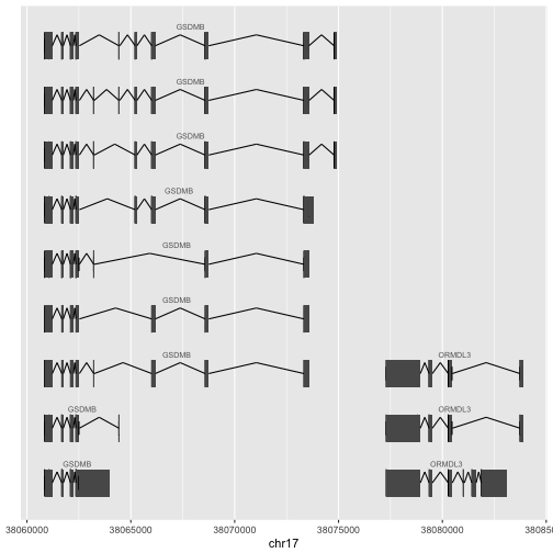
Here is an example of how to use ggbio to visualize two neigboring genes of interest in asthma genomics. The basic process is:
- attach needed packages
- obtain GRanges for genes (conveniently organized in the
genesymboldata element of the biovizBase package - use ggbio’s
autoplotwith the Homo.sapiens package to isolate the gene models of interest - evaluate the plot, adding a chromosome name
library(ggbio)
library(Homo.sapiens)
data(genesymbol, package="biovizBase")
oo = genesymbol[c("ORMDL3", "GSDMB")]
ap1 = autoplot(Homo.sapiens, which=oo, gap.geom="chevron")
attr(ap1, "hasAxis") = TRUE
ap1 + xlab("chr17")
With data
More compelling is the juxtaposition of experimental data with gene model layouts. In the following, we obtain the GRanges for a different gene and use that to subset the ESRRA binding sites as found in GM12878.
library(ERBS)
data(GM12878)
pl = genesymbol["ATP5D"]
ap2 = autoplot(Homo.sapiens, which=pl+5000, gap.geom="chevron")
ap3 = autoplot(subsetByOverlaps(GM12878, pl+5000))
ch = as.character(seqnames(pl)[1])
tracks(`ESRRA BS`=ap3, TX=ap2, heights=c(1,3))
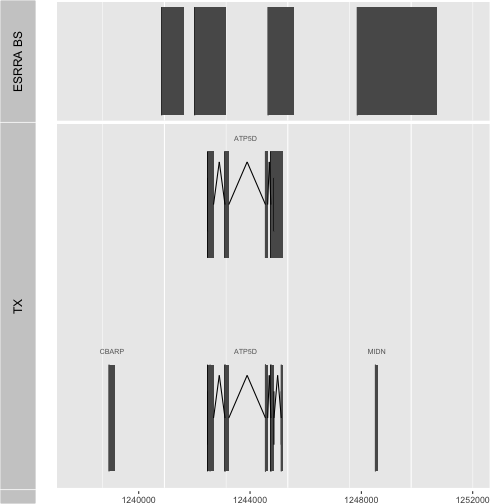
Question: How many regions are identified in GM12878 as binding sites for ESRRA in the vicinity of ATP5D as displayed with this code?
Substitute the binding sites detected in HepG2. How many regions are identified as binding sites in the vicinity of ATP5D for this cell type?
Visualization interfaces
In this section we move beyond scripts to visualize specific genomic elements, to produce more general tools.
- We begin with the concept of a parametrized function that produces a display for any gene symbol. The user can also specify the radius around the gene to be visualized.
- We then consider how to create an interactive tool that runs in the browser, to display results for selected genes without programming R directly.
- We then show how to create a dynamic interactive display, with tooltips that can provide information about selected points.
Driving visualization with functions
The construction of tools that enable flexible visualization is relatively easy once you know the basic layout. We have a much more general tool for ESRRA binding visualization if we use a function:
vizBsByGene = function(sym="ATP5D", radius=5000) {
   require(ERBS)
   require(biovizBase)
   data(GM12878)
   pl = try(genesymbol[sym])
   if (inherits(pl, "try-error")) stop("symbol not found")
   ap2 = autoplot(Homo.sapiens, which=pl+radius, gap.geom="chevron")
   ss <- subsetByOverlaps(GM12878, pl+radius)
   if (length(ss)==0) stop("no binding sites near gene")
   ap3 = autoplot(ss)
   ch = as.character(seqnames(pl)[1])
   tracks(`ESRRA BS`=ap3, TX=ap2, heights=c(1,3))
}
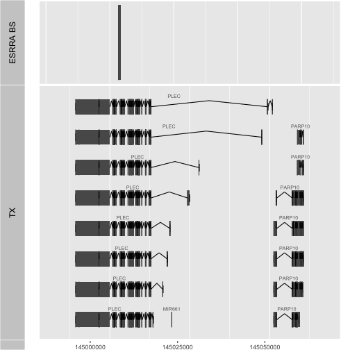
Now we are providing a tool that anyone can use to inspect the situation for a gene of interest.
vizBsByGene(sym="PLEC", radius=10000)
Interactive visualization: driving function calls with the browser
Given a function like vizBsByGene, we can use the shiny package to create a tool that can be used outside of R.
shi1 = function() {
#
# package setup
#
 library(ggbio)
 library(shiny)
 library(biovizBase)
 library(Homo.sapiens)
 library(ERBS)
 library(GenomicRanges)
#
# acquire gene regions and binding site locations
#
 data(genesymbol)
 data(GM12878)
#
# define the plotting function
#
 vizBsByGene = function(sym="ATP5D", radius=5000) {
   pl = try(genesymbol[sym])
   if (inherits(pl, "try-error")) stop("symbol not found")
   ap2 = autoplot(Homo.sapiens, which=pl+radius, gap.geom="chevron")
   ss <- subsetByOverlaps(GM12878, pl+radius)
   if (length(ss)==0) stop("no binding sites near gene")
   ap3 = autoplot(ss)
   ch = as.character(seqnames(pl)[1])
   tracks(`ESRRA BS`=ap3, TX=ap2, heights=c(1,3))
 }
#
# set up vector of gene names
#
 okg = sort(unique(names(subsetByOverlaps(genesymbol+5000, GM12878))))
#
# define the user interface
#
 ui = fluidPage(
  sidebarLayout(
   sidebarPanel(
    helpText("select gene symbol to see gene model and ESRRA binding sites found in GM12878"),
    selectInput("sym", "gene", choices=okg, selected=okg[1])
    ),
   mainPanel(
    plotOutput("vizbs")
    )
   )
  )
#
# define the server
#
 server = function(input, output) {
  output$vizbs = renderPlot({
   showNotification("deriving plot")
   vizBsByGene(sym=input$sym)
  })
 }
#
# execute, when function shi1() is evaluated
#
 shinyApp(ui=ui, server=server)
}
Copy this into your R session and run shi1(). The computations are
slow but this interface has some advantages over manual command line interactions.
The basic components are:
- the
ui(user interface), which defines how the page will appear to the user and sets up basic aspects of the communication between user, browser and R - the
server, which carries out the primary computations with data.
Some additional details:
fluidPagedefines the basic approach to structuring HTML in a pagesidebarLayoutis a particularly straightforward approach to isolating the interactive element (sidebarPanel) and the data presentation (mainPanel)selectInputis a function that generates a dropdown list with selectize capabilities – you can delete the string in the box and start typing a new string (gene symbol) and the component will ‘sift through’ choices compatible with what you typeplotOutputis used to define where the selected plot will appearrenderPlotdefines the server-side operation of collecting data from the UI and using it to compute on the analytical data to generate the plot
Many other components are available in the
shiny package to obtain different types of input
and generate different types of output. It is worth knowing that the renderPlot
function is reactive – when any data value connected to the input object
changes, the renderPlot function is re-evaluated, and the corresponding output
element is updated.
Dynamic interactive visualization: plotly for details on hover; pan and zoom
The shiny function coded above produces an interactive interface to generate
static plots. The plotly library provides facilities for creating interactive,
dynamic plots. This works closely with the ggplot2 package and we will
briefly introduce its key concepts.
ggplot2 is an implementation of a conceptual system due to Leland Wilkinson called
the grammar of graphics. The details of the grammar are complicated. A very
abbreviated account is as follows:
- variables in a data.frame are the main resource
- geometric primitives are catalogued: points, lines, paths, boxplots, smooths
- geometric elements have properties, these are called ‘aesthetics’ the graph designer defines maps from the data variables to these aesthetics
- plotting axes may be rescaled
- multivariate data may be decomposed into facets that are separated but presented together in a structured way
See Hadley Wickham’s JCGS paper preprint for a complete account.
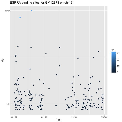
As an illustration we will consider the fluctuation of signal values of the ESRRA binding experiment over genomic coordinates of chr19. We’ll start by setting up the data resource and its basic aesthetic bindings.
gm19 = GM12878[ which(seqnames(GM12878)=="chr19") ]
gm19df = data.frame(loc=start(gm19), sig=gm19$signalValue,
           qv=gm19$qValue, tt="a\nb")
library(ggplot2)
pl = ggplot(gm19df, aes(x=loc, y=sig, colour=qv, text=tt))
Once this is done, we create the plot by specifying the geometric elements to be used, and the scale modification.
spl = pl + geom_point() + scale_y_log10() +
    ggtitle("ESRRA binding sites for GM12878 on chr19")
spl
To make this a dynamic visualization, we load the plotly library and invoke ggplotly. As you move the mouse over points, a tooltip popup is generated. Additionally you can create a window using the mouse to produce a zoomed view. Rectangular or oval regions of focuse can be created using the different modes that are started by clicking on dashed region icons at the upper right corner of the display.
library(plotly)
ggplotly(spl)
At present we don’t have a way of easily embedding the interactive visualization into book pages. However you can get a feel for the type of display achievable in this way by visiting this plotly site. Just click the “X” in upper right corner of any login prompt and you will be able to manipulate the scatterplot display.
As of December 2017, it is not possible to have plotly interoperating with ggbio visualizations. But there will undoubtedly be progress in the near future in integrating the high-level genomic visualization toolkits with general frameworks for dynamic display.
Summary
- ggbio packages a variety of genomically informative visual elements (combinations of rectangle and chevron glyphs for gene models, for example) that can be used to juxtapose experimental and reference data
- shiny supports the design of browser-based interfaces to R functions and data; we demonstrated how static graphics could be generated for user-selected gene symbol
- plotly supports the design of dynamic graphics on top of statically-defined graphs produced with ggplot2