Clustering
Basic Machine Learning
Machine learning is a very broad topic and a highly active research area. In the life sciences, much of what is described as “precision medicine” is an application of machine learning to biomedical data. The general idea is to predict or discover outcomes from measured predictors. Can we discover new types of cancer from gene expression profiles? Can we predict drug response from a series of genotypes? Here we give a very brief introductions to two major machine learning components: clustering and class prediction. There are many good resources to learn more about machine learning, for example this book.
Clustering
We will demonstrate the concepts and code needed to perform clustering analysis with the tissue gene expression data:
library(tissuesGeneExpression)
data(tissuesGeneExpression)
To illustrate the main application of clustering in the life sciences, let’s pretend that we don’t know these are different tissues and are interested in clustering. The first step is to compute the distance between each sample:
d <- dist( t(e) )
Hierarchical clustering
With the distance between each pair of samples computed, we need clustering algorithms to join them into groups. Hierarchical clustering is one of the many clustering algorithms available to do this. Each sample is assigned to its own group and then the algorithm continues iteratively, joining the two most similar clusters at each step, and continuing until there is just one group. While we have defined distances between samples, we have not yet defined distances between groups. There are various ways this can be done and they all rely on the individual pairwise distances. The helpfile for hclust includes detailed information.
We can perform hierarchical clustering based on the distances defined above using the hclust function. This function returns an hclust object that describes the groupings that were created using the algorithm described above. The plot method represents these relationships with a tree or dendrogram:
library(rafalib)
mypar()
hc <- hclust(d)
hc
##
## Call:
## hclust(d = d)
##
## Cluster method   : complete
## Distance         : euclidean
## Number of objects: 189
plot(hc,labels=tissue,cex=0.5)
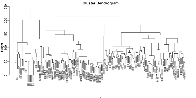
Does this technique “discover” the clusters defined by the different tissues? In this plot, it is not easy to see the different tissues so we add colors by using the mypclust function from the rafalib package.
myplclust(hc, labels=tissue, lab.col=as.fumeric(tissue), cex=0.5)
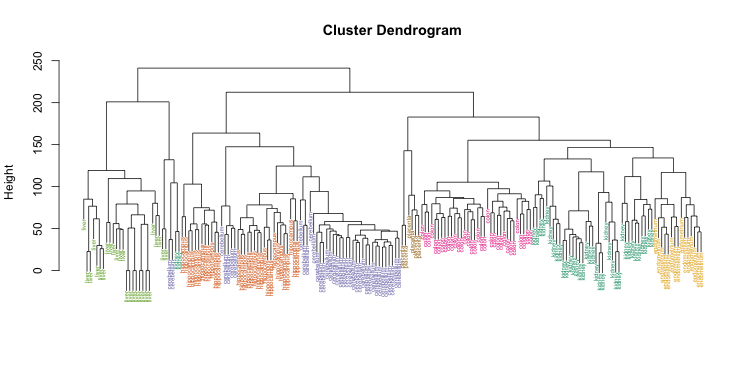
Visually, it does seem as if the clustering technique has discovered the tissues. However, hierarchical clustering does not define specific clusters, but rather defines the dendrogram above. From the dendrogram we can decipher the distance between any two groups by looking at the height at which the two groups split into two. To define clusters, we need to “cut the tree” at some distance and group all samples that are within that distance into groups below. To visualize this, we draw a horizontal line at the height we wish to cut and this defines that line. We use 120 as an example:
myplclust(hc, labels=tissue, lab.col=as.fumeric(tissue),cex=0.5)
abline(h=120)
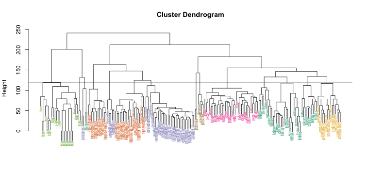
If we use the line above to cut the tree into clusters, we can examine how the clusters overlap with the actual tissues:
hclusters <- cutree(hc, h=120)
table(true=tissue, cluster=hclusters)
##              cluster
## true           1  2  3  4  5  6  7  8  9 10 11 12 13 14
##   cerebellum   0  0  0  0 31  0  0  0  2  0  0  5  0  0
##   colon        0  0  0  0  0  0 34  0  0  0  0  0  0  0
##   endometrium  0  0  0  0  0  0  0  0  0  0 15  0  0  0
##   hippocampus  0  0 12 19  0  0  0  0  0  0  0  0  0  0
##   kidney       9 18  0  0  0 10  0  0  2  0  0  0  0  0
##   liver        0  0  0  0  0  0  0 24  0  2  0  0  0  0
##   placenta     0  0  0  0  0  0  0  0  0  0  0  0  2  4
We can also ask cutree to give us back a given number of clusters. The function then automatically finds the height that results in the requested number of clusters:
hclusters <- cutree(hc, k=8)
table(true=tissue, cluster=hclusters)
##              cluster
## true           1  2  3  4  5  6  7  8
##   cerebellum   0  0 31  0  0  2  5  0
##   colon        0  0  0 34  0  0  0  0
##   endometrium 15  0  0  0  0  0  0  0
##   hippocampus  0 12 19  0  0  0  0  0
##   kidney      37  0  0  0  0  2  0  0
##   liver        0  0  0  0 24  2  0  0
##   placenta     0  0  0  0  0  0  0  6
In both cases we do see that, with some exceptions, each tissue is uniquely represented by one of the clusters. In some instances, the one tissue is spread across two tissues, which is due to selecting too many clusters. Selecting the number of clusters is generally a challenging step in practice and an active area of research.
K-means
We can also cluster with the kmeans function to perform k-means clustering. As an example, let’s run k-means on the samples in the space of the first two genes:
set.seed(1)
km <- kmeans(t(e[1:2,]), centers=7)
names(km)
## [1] "cluster"      "centers"      "totss"        "withinss"
## [5] "tot.withinss" "betweenss"    "size"         "iter"
## [9] "ifault"
mypar(1,2)
plot(e[1,], e[2,], col=as.fumeric(tissue), pch=16)
plot(e[1,], e[2,], col=km$cluster, pch=16)
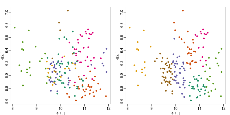
In the first plot, color represents the actual tissues, while in the second, color represents the clusters that were defined by kmeans. We can see from tabulating the results that this particular clustering exercise did not perform well:
table(true=tissue,cluster=km$cluster)
##              cluster
## true           1  2  3  4  5  6  7
##   cerebellum   0  1  8  0  6  0 23
##   colon        2 11  2 15  4  0  0
##   endometrium  0  3  4  0  0  0  8
##   hippocampus 19  0  2  0 10  0  0
##   kidney       7  8 20  0  0  0  4
##   liver        0  0  0  0  0 18  8
##   placenta     0  4  0  0  0  0  2
This is very likely due to the fact the the first two genes are not informative regarding tissue type. We can see this in the first plot above. If we instead perform k-means clustering using all of the genes, we obtain a much improved result. To visualize this, we can use an MDS plot:
km <- kmeans(t(e), centers=7)
mds <- cmdscale(d)

mypar(1,2)
plot(mds[,1], mds[,2])
plot(mds[,1], mds[,2], col=km$cluster, pch=16)
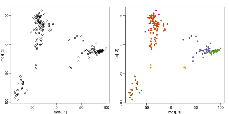
By tabulating the results, we see that we obtain a similar answer to that obtained with hierarchical clustering.
table(true=tissue,cluster=km$cluster)
##              cluster
## true           1  2  3  4  5  6  7
##   cerebellum   0  0  5  0 31  2  0
##   colon        0 34  0  0  0  0  0
##   endometrium  0 15  0  0  0  0  0
##   hippocampus  0  0 31  0  0  0  0
##   kidney       0 37  0  0  0  2  0
##   liver        2  0  0  0  0  0 24
##   placenta     0  0  0  6  0  0  0
Heatmaps
Heatmaps are ubiquitous in the genomics literature. They are very useful plots for visualizing the measurements for a subset of rows over all the samples. A dendrogram is added on top and on the side that is created with hierarchical clustering. We will demonstrate how to create heatmaps from within R. Let’s begin by defining a color palette:
library(RColorBrewer)
hmcol <- colorRampPalette(brewer.pal(9, "GnBu"))(100)
Now, pick the genes with the top variance over all samples:
library(genefilter)
## Creating a generic function for 'nchar' from package 'base' in package 'S4Vectors'
##
## Attaching package: 'genefilter'
##
## The following object is masked from 'package:base':
##
##     anyNA
rv <- rowVars(e)
idx <- order(-rv)[1:40]
While a heatmap function is included in R, we recommend the heatmap.2 function from the gplots package on CRAN because it is a bit more customized. For example, it stretches to fill the window. Here we add colors to indicate the tissue on the top:
library(gplots) ##Available from CRAN
cols <- palette(brewer.pal(8, "Dark2"))[as.fumeric(tissue)]
head(cbind(colnames(e),cols))
##                        cols
## [1,] "GSM11805.CEL.gz" "#1B9E77"
## [2,] "GSM11814.CEL.gz" "#1B9E77"
## [3,] "GSM11823.CEL.gz" "#1B9E77"
## [4,] "GSM11830.CEL.gz" "#1B9E77"
## [5,] "GSM12067.CEL.gz" "#1B9E77"
## [6,] "GSM12075.CEL.gz" "#1B9E77"
heatmap.2(e[idx,], labCol=tissue,
          trace="none",
          ColSideColors=cols,
          col=hmcol)
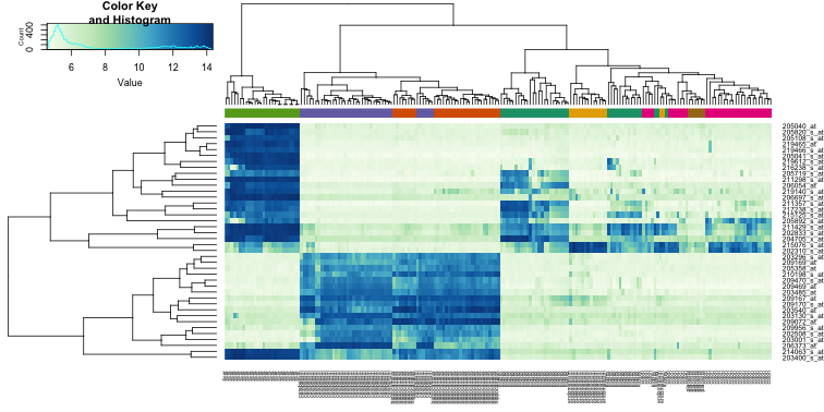
We did not use tissue information to create this heatmap, and we can quickly see, with just 40 genes, good separation across tissues.