Multidimensional scaling
Multi-Dimensional Scaling Plots
We will motivate multi-dimensional scaling (MDS) plots with a gene expression example. To simplify the illustration we will only consider three tissues:
library(rafalib)
library(tissuesGeneExpression)
data(tissuesGeneExpression)
colind <- tissue%in%c("kidney","colon","liver")
mat <- e[,colind]
group <- factor(tissue[colind])
dim(mat)
## [1] 22215 99
As an exploratory step, we wish to know if gene expression profiles stored in the columns of mat show more similarity between tissues than across tissues. Unfortunately, as mentioned above, we can’t plot multi-dimensional points. In general, we prefer two-dimensional plots, but making plots for every pair of genes or every pair of samples is not practical. MDS plots become a powerful tool in this situation.
The math behind MDS
Now that we know about SVD and matrix algebra, understanding MDS is relatively straightforward. For illustrative purposes let’s consider the SVD decomposition:
and assume that the sum of squares of the first two columns is much larger than sum of squares of all other columns. This can be written as: with the i-th entry of the matrix. When this happens, we then have:
This implies that column is approximately:
If we define the following two dimensional vector…
… then
This derivation tells us that the distance between samples and is approximated by the distance between two dimensional points.
Because is a two dimensional vector, we can visualize the distances between each sample by plotting versus and visually inspect the distance between points. Here is this plot for our example dataset:
s <- svd(mat-rowMeans(mat))
PC1 <- s$d[1]*s$v[,1]
PC2 <- s$d[2]*s$v[,2]
mypar(1,1)
plot(PC1,PC2,pch=21,bg=as.numeric(group))
legend("bottomright",levels(group),col=seq(along=levels(group)),pch=15,cex=1.5)
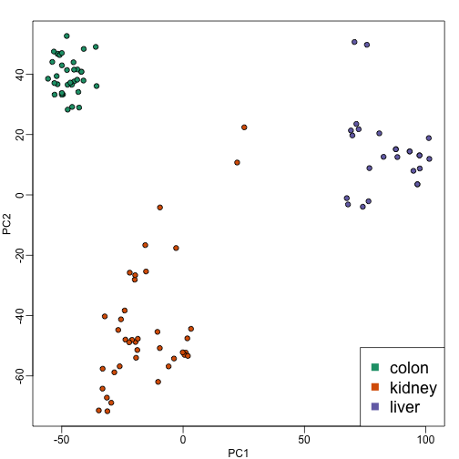
Note that the points separate by tissue type as expected. Now the accuracy of the approximation above depends on the proportion of variance explained by the first two principal components. As we showed above, we can quickly see this by plotting the variance explained plot:
plot(s$d^2/sum(s$d^2))
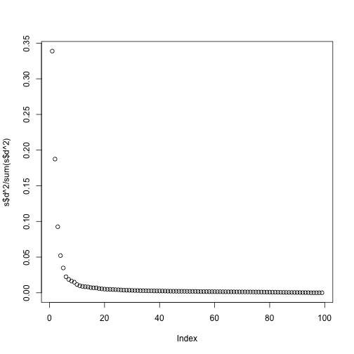
Although the first two PCs explain over 50% of the variability, there is plenty of information that this plot does not show. However, it is an incredibly useful plot for obtaining, via visualization, a general idea of the distance between points. Also, notice that we can plot other dimensions as well to search for patterns. Here are the 3rd and 4th PCs:
PC3 <- s$d[3]*s$v[,3]
PC4 <- s$d[4]*s$v[,4]
mypar(1,1)
plot(PC3,PC4,pch=21,bg=as.numeric(group))
legend("bottomright",levels(group),col=seq(along=levels(group)),pch=15,cex=1.5)
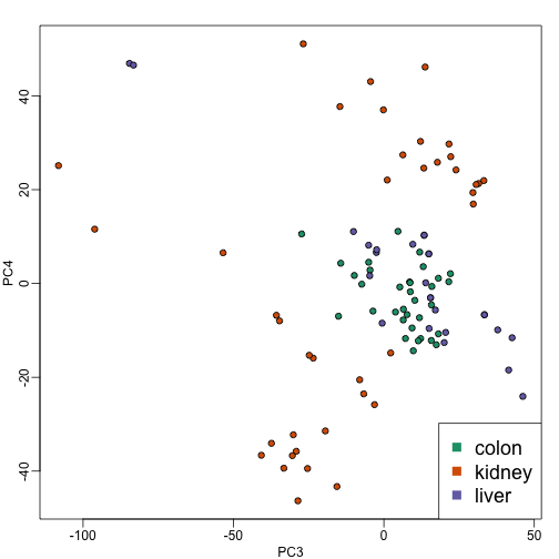
Note that the 4th PC shows a strong separation within the kidney samples. Later we will learn about batch effects, which might explain this finding.
cmdscale
Although we used the svd functions above, there is a special function that is specifically made for MDS plots. It takes a distance object as an argument and then uses principal component analysis to provide the best approximation to this distance that can be obtained with dimensions. This function is more efficient because one does not have to perform the full SVD, which can be time consuming. By default it returns two dimensions, but we can change that through the parameter k which defaults to 2.
d <- dist(t(mat))
mds <- cmdscale(d)

mypar()
plot(mds[,1],mds[,2],bg=as.numeric(group),pch=21,
     xlab="First dimension",ylab="Second dimension")
legend("bottomleft",levels(group),col=seq(along=levels(group)),pch=15)
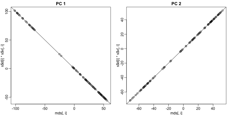
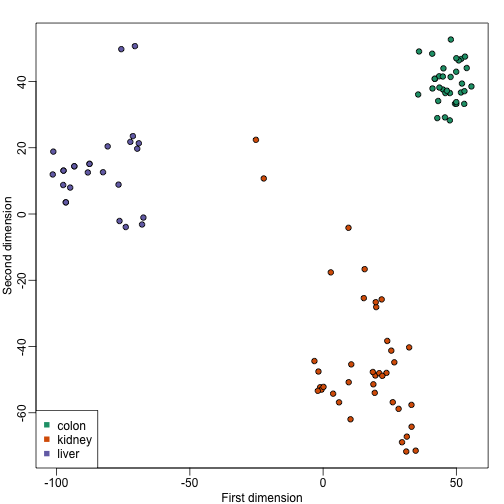 These two approaches are equivalent up to an arbitrary sign change.
mypar(1,2)
for(i in 1:2){
  plot(mds[,i],s$d[i]*s$v[,i],main=paste("PC",i))
  b = ifelse( cor(mds[,i],s$v[,i]) > 0, 1, -1)
  abline(0,b) ##b is 1 or -1 depending on the arbitrary sign "flip"
}
Why the arbitrary sign?
The SVD is not unique because we can multiply any column of by -1 as long as we multiply the sample column of by -1. We can see this immediately by noting that:
Why we substract the mean
In all calculations above we subtract the row means before we compute the singular value decomposition. If what we are trying to do is approximate the distance between columns, the distance between and is the same as the distance between and since the cancels out when computing said distance:
Because removing the row averages reduces the total variation, it can only make the SVD approximation better.